WINNER WINNER CHICKEN DINNER
BOLD & BRIGHT
Crayola's first version of construction paper crayons were good, but they leaned more towards pastel/muted tones. Sargent came out with their own version that was really wonderful. The colors were truer & came in a wider range. The Bold & Bright version of Crayola's construction paper crayons are really wonderful. The 8 pack(what is available at Dollar Tree) is nice, but the 24 pack offers so many colors that are truly beautiful & work so well together.
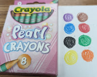
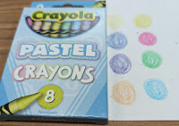
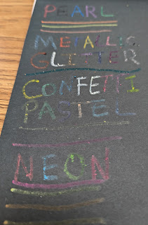
PEARL & PASTEL
I liked both the Pearl & Pastel crayons. I'm not sure I'd say they are MUST HAVE's, but they would be nice editions. The colors are nice & I feel they deliver on what they claim to be!
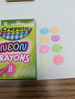
NEON
The neon are just ok. I think kids would enjoy them. However, the color does not go down as well as regular colors & they really are a niche selection with limited use in most works of art.
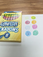
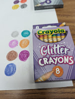
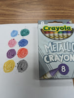
CONFETTI, METALLIC, GLITTER
Save your money! I don't really get the Confetti crayons at all?! The ones that actually show other colors present kind of make mud. The ones where the color doesn't show up just look like regular crayons. So why bother? The Metallic & Glitter both have very little sparkle. If you hold the paper just right in the perfect light, maybe. Once again...why bother? Your money can be spent else where(like on the Bold & Bright!).
Don't take my word for it...go to Dollar Tree and pick you up the ones you are curious about. You may love the ones I didn't?!?


